How To Build Charts Using The Chart Wizard
Five Labs: How To Create A Chart Using The Chart Wizard In Five
Welcome to Five Labs, a step-by-step guide to building applications using Five.
Charts are vital tools in data analysis, turning complex data into understandable visual formats, with Five’s Chart Wizard, this process becomes intuitive and accessible. Some of the most common types of charts include bar, line, pie, and even Gantt charts.
Table of Contents
Prerequisites
By the end of this lab, you’ll understand how to utilize the Chart Wizard in Five and integrate these charts as interactive elements in your applications, particularly for visualizing data effectively.
This is part 2 of a series. Make sure you have gone through the first part on how to create SQL queries because we will be using the same query here to build a chart.
- Have Five installed in your system or a cloud subscription.
- A query built on Five that can be used with charts.
Don’t Feel Like Reading?
Watch the YouTube video and learn how to use the Chart Wizard.
Step 1: Adding a Chart Item
We can start by navigating to the Visuals section in Five and selecting the Chart Wizard and you should be presented with an interface similar to the one shown below.
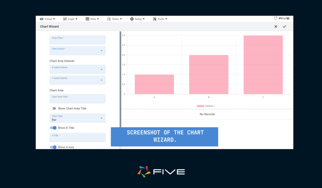
Start by naming your chart by giving it a descriptive title, like “Product Sales Analysis“.
Then in the Data Source lookup, you can select from existing tables, queries, or API connections. For this chart, we will be using the query that we built earlier. Selecting the query will show you the response on the bottom right corner of the screen for your reference.
Decide which fields to display. For a sales chart, you might select the product name for the X-axis and sales figures for the Y-axis. For this tutorial, we are selecting the product name in the X-axis and their Quantity in the Y-axis.
Next, give your chart a title in the ‘Chart Area Title’ section. This title will be displayed at the top of the chart and is different from the title we gave it earlier; we are going to name it “Quantity” but feel free to give it a descriptive name of your choice.
Customizing the Chart
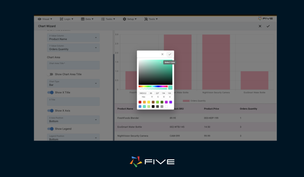
Now, as you scroll down, you’ll see other options that help you customize your chart like axis labels, legends, and titles.
In the chart type lookup, you can change the chart from a bar graph to other types, such as line, pie, or horizontal bar. Feel free to choose any chart type that you prefer. For this tutorial, we will be using a bar graph.
as you scroll further down you get a color picker which as the name suggests lets you decide on a color for your chart (or multiple colors if we have a pie, donut, etc)
Now we can click on save and our chart is ready to use.
Adding Layers and Data Sets
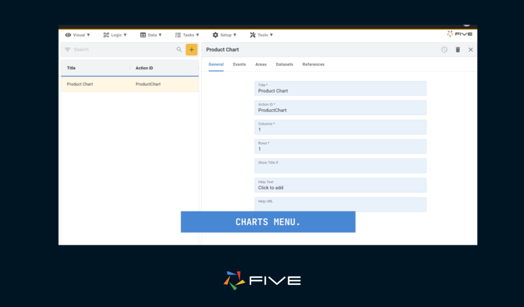
For a more detailed analysis, you can add additional information to your charts. Navigate to ‘Visuals’ then after clicking on the Chart Wizard, click on the menu item that just says “Charts”.
Here, you will be able to view the chart we just created. Additionally, you can enhance these charts with more detailed information, such as incorporating multiple datasets for comparing various types of information on a single chart. You can also assign rows and columns if you wish to display multiple layers of graphs within a single chart item.
Step 2: Attaching the Chart to Your Application
Now that our chart is ready to use let’s add a menu item in your end-user application through which we can view our chart.
Head over to the ‘Visual’ section again and select ‘Menu’. Here, we’ll create a new menu item. In the ‘Action’ field, select the chart that we just made.
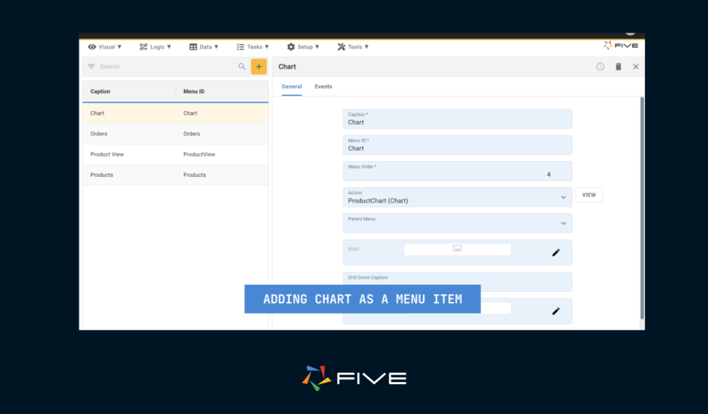
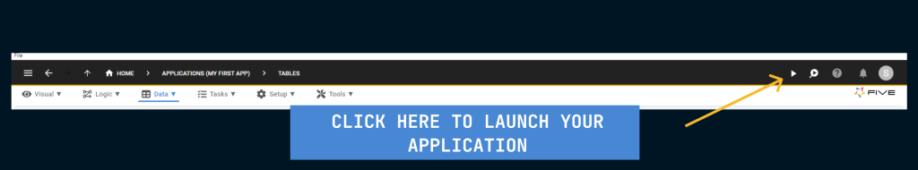
Now click on Save and we can run our application to see how our chart looks like in the end-user application.
Conclusion
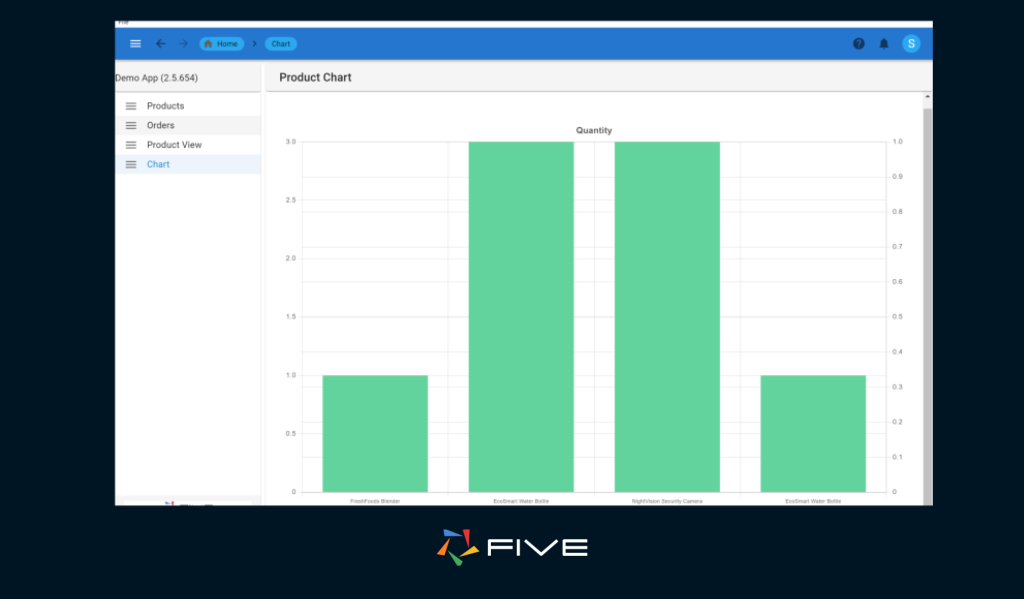
The chart in our end-user application will look something like this:
Congratulations we just learned how to build charts inside Five.
This blog provides a guide on building charts in Five, it covers several key aspects: first, adding a chart item, where you name your chart and select a data source from tables, queries, or connections. Then, it delves into selecting the data source, detailing how to choose the fields for display and the chart type that best complements your data. Finally, the blog guides you through customizing your chart, including adjustments to its appearance, settings, and layers.