Charts & Dashboards [Excel to Web App – Part 5]
Charts & Dashboards [Excel to Web App – Part 5]
Welcome to part 5 of our five-part Excel to Web App guide.
In this part, we want to add charts and dashboards to our application. Charts and dashboards help us make sense of our data. Five comes with a library of prebuilt charts, such as bar, radar, or pie charts. And they can easily be combined into sophisticated dashboards for business intelligence and analytics.
So let’s learn how to build a chart on top of our data.
Ready to Convert Your Spreadsheet to a Web App?
Transform your Excel files into powerful, secure web applications without the coding headache. Our experts will convert your spreadsheet with:
Free consultation & fixed-price quote
Convert Your Spreadsheet Into a Beautiful Web App: Follow Our 5-Part Guide
This blog post is part 5 of a 5-part series on converting Excel spreadsheets to web apps. To view the other parts, follow the links here:
- Part 1: Excel to Web App – Creating a Database and Forms
- Part 2: Excel to Web App – Calculating a Field
- Part 3: Excel to Web App – Adding a Theme
- Part 4: Excel to Web App – Adding Logins to Your App
Building Charts in Five
Step 1: Creating a Chart
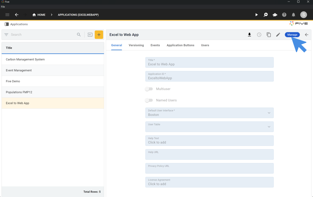
To create a chart in your application, open Five, click on your application, and then on Manage.
Next, click on Visual > Chart Wizard. Here’s what Five’s Chart Wizard looks like:
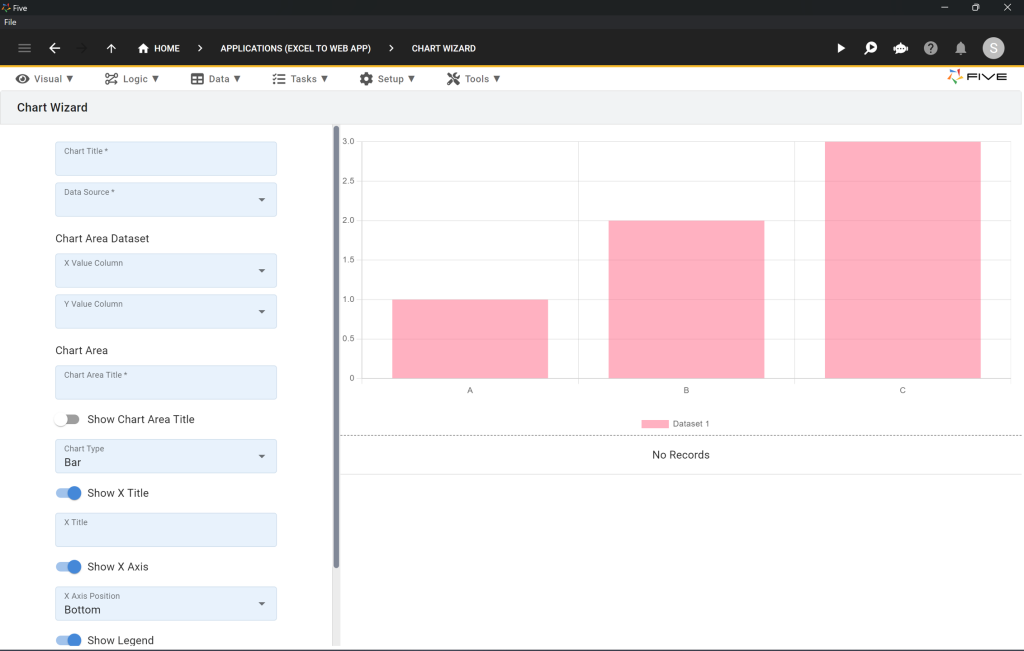
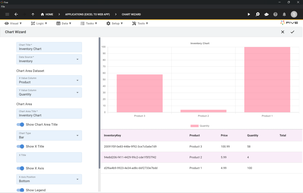
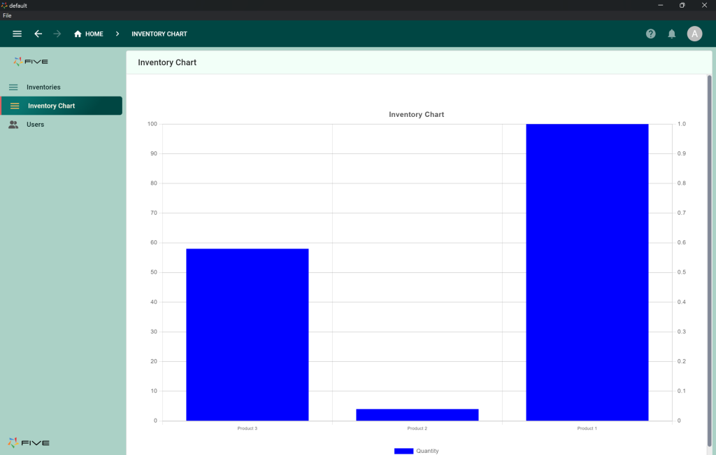
Let’s say we want to create a chart that displays our products on the X-axis, and quantities on the Y-axis.
- Give your chart a title, such as Inventory Chart.
- Pick your data source, i.e. the Inventory table.
- Define your X Value Column, i..e Product.
- Define your Y Value Column, i.e. Quantity
- Give your chart area a title. Let’s go with Inventory Chart again. Toggle Show Chart Area Title on.
- Select a Chart Type. We will stick with a Bar Chart.
- Last, save by clicking the Tick icon in the top right corner.
Here’s what your chart settings should look like:
Step 2: Adding a Chart to Your App
Now let’s add the chart we have just created to our application.
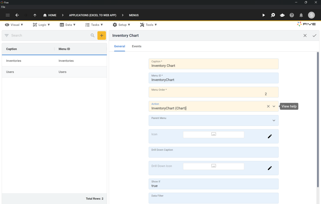
- Click on Visual > Menus.
- Click the yellow Plus icon to create a new menu item in your app.
- For Caption, write Inventory Chart.
- For Menu Order, write 2
- In the Action dropdown select InventoryChart (Chart).
- Last, save by clicking the Tick icon in the top right corner.
Here’s what your menu item should look like:
Now, let’s launch our application to see what we have developed. As usual, run the app by clicking the Run ▶️ button in the top right corner.
Here’s what the chart looks like in our application.
Step 3: Building Dashboards
We have just successfully added a chart to our application. But let’s say we’re not quite happy with the result: a single chart occupies our entire screen, the colors seem a bit odd, and our end-users are demanding something more powerful.
That’s where dashboards come in. By using Five’s dashboarding feature, we can create beautiful dashboards that combine charts, reports, and drill-downs all in one page.
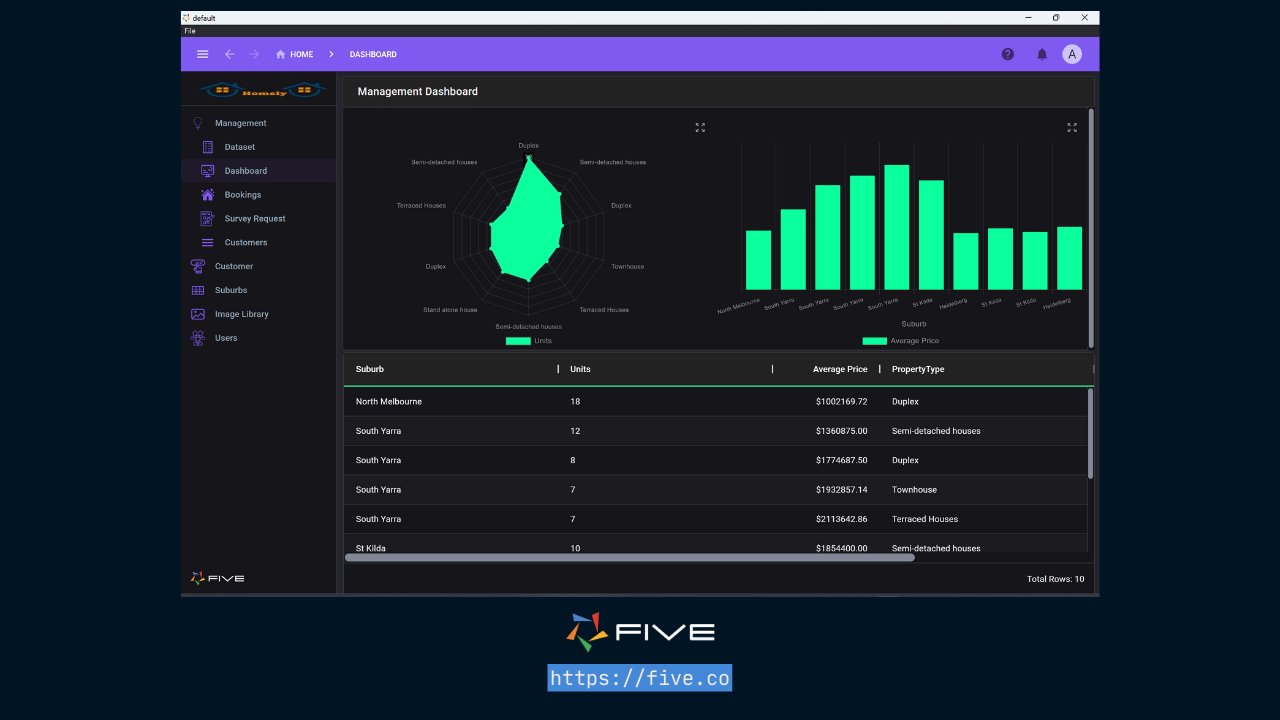
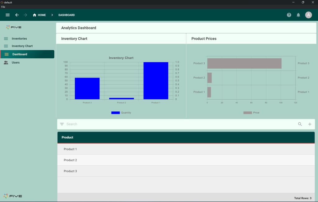
Here’s an example of a dashboard that combines a radar chart with a bar chart and a data report all on one page. Of course, we can also create combined charts (such as a bar chart with a line chart on top) or create drill-downs into charts where data dynamically changes.
To build a dashboard, you first need more than one chart. Since we have just shown you how to create charts, we won’t go through the steps again. Simply follow the steps above.
To create a dashboard,
- Click on Visual > Dashboards.
- Click the yellow Plus icon to create a new dashboard.
- Give your dashboard a Title such as Analytics Dashboard.
- Define the number of Columns and Rows in your dashboard. Let’s go with 2 columns and 2 rows.
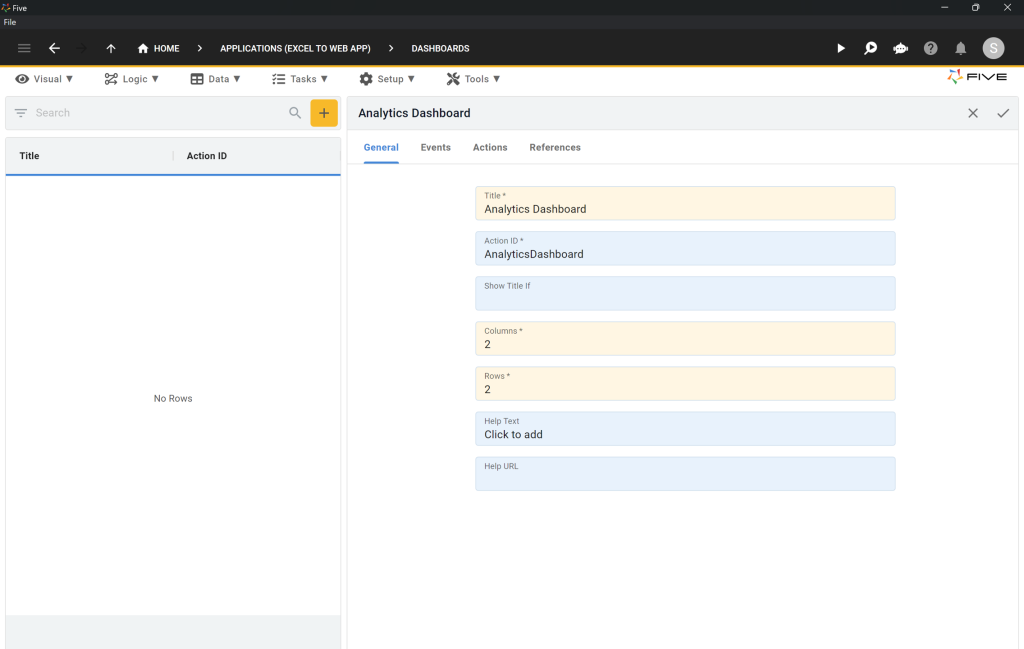
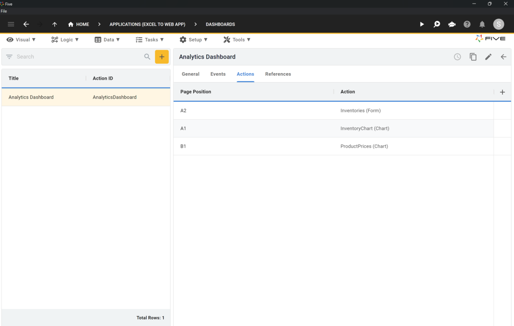
Next, click on Actions and then on the Plus icon, as shown in the image below.
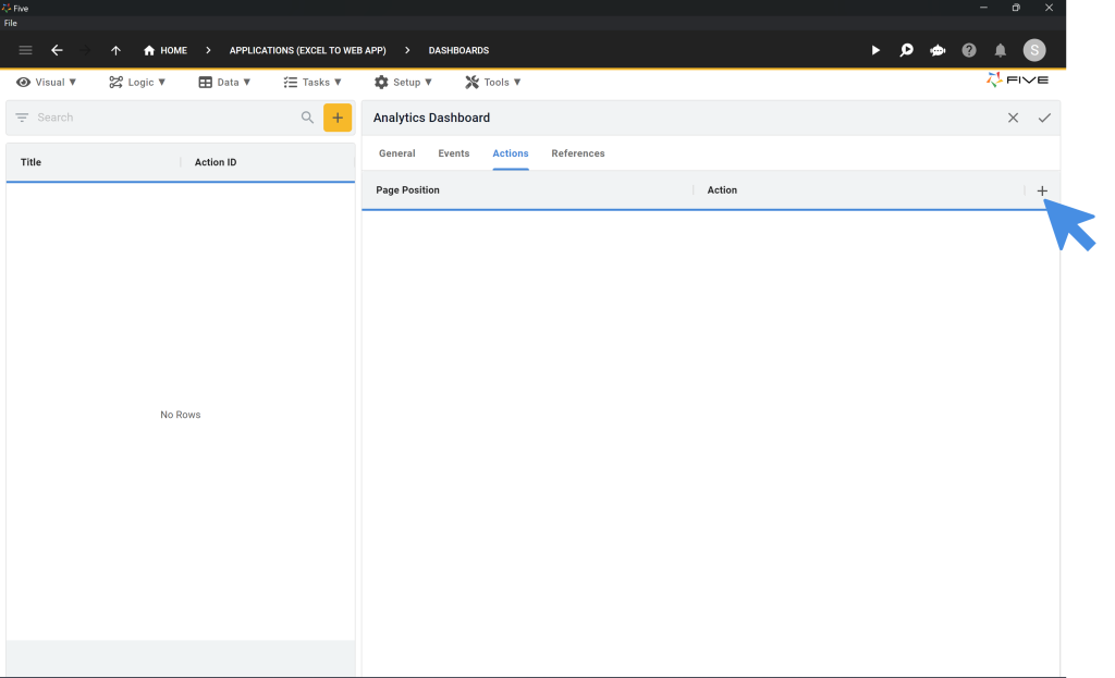
Five will now ask you to define a Page Position and an Action. Page Position translates the grid you have just defined (remember our 2 rows and 2 columns?) into a user interface. Action lists out all your charts, forms, and other actions that you have created in Five.
Here’s how we have defined our page positions and actions:
Last, save by clicking the Tick icon in the top right corner.
There’s one more step: we need to add our dashboard to our application menu. Simply follow the step 2 above to do so.
Now, let’s run the app again to see what we have developed. Click on Run ▶️ in the top right corner to preview your app. Here’s what our dashboard looks like:
Charts and Dashboards: Expansions
We now have a working application with a form, a chart, and a dashboard.
If you don’t like the way your dashboard looks, play around with the colors, titles, or chart types. There are plenty of customization options available to build the dashboard you need! You can also add an “export to CSV” feature to your application, for example.
Finding Help in Five
In case you get stuck during the development process, we’re here to help! Continue developing your application by accessing these resources:
- Five’s User Community: Visit https://five.org to ask questions or get inspiration from other users.
- Five’s Documentation: Visit help.five.org to access Five’s comprehensive documentation.
Five’s In-App Help
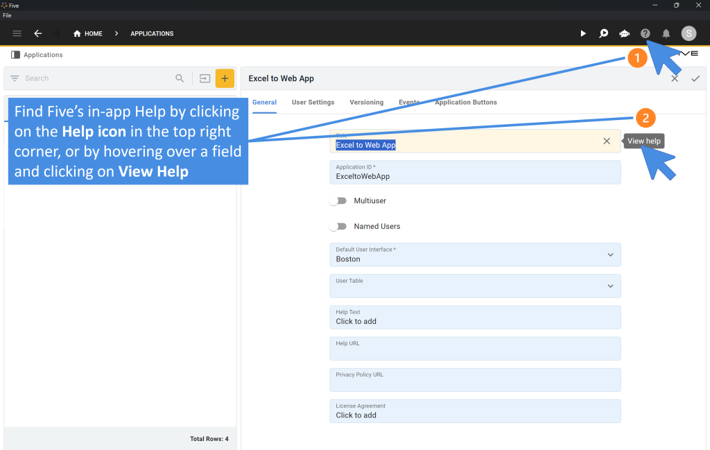
Last, find useful tips for your application development by clicking on Five’s in-app help available in the top right corner or on almost any field.
Get Your App Online For US$29.99 Per Month
To deploy your application, sign up for one of our paid plans, starting from US$29.99 per month and application. Your plan includes unlimited end-users and provides you with a custom URL to access the application online.
Host Your App Online
Select one of our hosting packages.
Starting from US$29.99 per app and month.
Unlimited end-users.


